How to prepare and use images on your website
So. you’re wanting to build a website. Congratulations! This can be a fun, yet challenging experience. Now that you’ve jumped in, you may have noticed that there are a lot of things to consider in the process. This article deals with properly using images on your website.
Plan your website
At the image selection point in the process, I’m going to assume you’ve already done some preliminary planning of your website or landing page. I won’t go into much detail here, but I’ll just point out the basics.
Structure
Be sure to understand the basic structure of your website and consider the user’s experience as they click through your pages.
Design
If you are a start-up business, I recommend finishing your branding before beginning your website design. Whether you handle your own branding, or hire a professional, establishing brand guidelines will make the design stage of the website much easier. If you need help with your branding, I offer this as a service. Check that out here.
Content
In my experience, most clients think the content will come later in the process. But content should be well developed and finalized before the design begins. The content will help determine the flow of information and the visual elements you’ll want to use. If you don’t have any idea about your content, I suggest you stop here and at least hone-in on your company’s vision, mission, and services before going any further. Create the copy and offers you plan to use, and then move into the design stage which will determine your photography needs.
Photography/Illustrations/Icons
Now that you have your design plan in place, you’ll want to gather your visual content. This article deals with photography, but you may also want to consider illustrations and icons.
Plan image usage
There are a few things to consider when planning image usage for websites. We all love to have a beautiful, eye-catching website. But you need to understand the goals of your website as well as the goals of your target audience. If your website demands super-fast downloads and no-nonsense end objectives, then you’ll want to keep image usage to a minimum. Also consider when images are merely enhancing visual appeal or informing the audience about the content. This is when accessibility issues come into play. Here’s some great information from an accessibility expert about images and accessibility.
Mood boards
Create mood boards to help formulate the style of photography you want to use. Whether you plan to use stock photos or do your own custom photography, this will help you narrow down the look and feel of your photos. You want your website to feel cohesive as the user journeys through the content. A quick and easy way to create a mood board is by using Pinterest. Simply create a private board and “pin” (add) things that inspire you within the vision and mission statement you’ve settled on. Once you have a good collection, go back and refine/remove choices that don’t fit with the overall look that has been created. Then take note of similar colors and pull out the dominant themes. This process will help you create your style guide and color scheme.
Color schemes
Use your branding style guide to determine your color schemes. If you still don’t have a brand, develop your color scheme from the mood board you created for your images.
Page flow
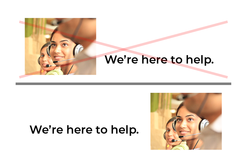
You may be wondering what page flow has to do with your images. But if you want a well thought out design, you want to think about the direction the objects or people in the images are facing and/or “moving”. Most of the time, you want people to face toward the action or important information in any given section. This aids the user in moving through your content in an organized way.
Stock images or custom photography
If you’re a photographer, then naturally you’ll want to use your own images. But even if you are, sometimes you just don’t have the right setup for the types of images you need–so you’ll want to rely on high quality stock images. There are a lot of great resources out there–some free and some come with high price tags. If you don’t need exclusive rights to any particular images, you’ll probably be ok with using images from free resources like Unsplash or Pexel.
Technical considerations
Now for the “important” part. At least in terms of a well-built website. Before uploading any of your images for use on your site, you’ll want to make sure you are using the correct file types and sizes. I’ll share other items to remember when adding them to any layout as well.
File type
They most common file type you’ll use for website images is jpg (or jpeg–Joint Photographic Experts Group–in case you were wondering what the letters stand for). It is a lossy file compression where the degree of loss (image quality) and file size can be adjusted when saving. Because of the advancements of online image optimization websites and plugins for WordPress sites, I save my jpg files at the highest quality and I let the plugin handle the compression. This ensures I begin with the best quality, and the plugin optimizes it according the settings I have for the current website.
PNG (Portable Network Graphic) files are most commonly used when you need an image to have a transparent background (a logo for instance). This file type is a lossless compression format and tends to be on the (comparatively) larger size. So I only use this format when a transparent background is absolutely necessary.
There are other formats, but for beginners, these are the only formats you really need to work with.
File size
There are general guidelines for sizing photos, but not all images are the same, so you can’t just size a batch of photos for web use and place them into your website. Well, you could, but they won’t be optimized for each particular layout. You want to size your image to the size it will be in the layout before you upload it. WordPress and page builders will do some resizing and cropping magic for you, but ideally, you want to use the correct size to begin with.
If your image is 300px by 350px, you don’t want to upload and use an image that is 2028px by 600px. That’s overkill and unnecessary. But if that image is meant to be a hero image (one that spans the width of the screen), then that size could be plausible. In short, keep the original in-tact and save a new version that is resized accordingly for each purpose.
Dpi (actually ppi), also known as screen resolution
Here’s where things can get quite confusing, and this article isn’t meant to delve into the technical aspects of all of this, but a little background can be helpful.
You’ve probably heard that screens only read 72 ppi (pixels per inch). At one time this was true. But now days, there’s a wide range of screen resolutions and this measurement is all but obsolete.
The most important thing to consider in image size are the pixel dimensions (ie. 300px x 400px). Now, were you going to print this image, it would need to have a dpi of at least 300. This is because the printer needs to know how many dots per inch to print the ink of the image.
So, don’t worry so much about this setting, and mainly concentrate on proper image optimization. This is done either via your image editing software or an online optimization tool as I mentioned above.
Color space
If you are using your image editing software setting to optimize for web, you probably won’t have to think about this. But for information’s sake, just know that you want to use RGB (red, green, blue) in most circumstances.
I’ll get into the different ways that colors are seen and displayed in another article, especially as it pertains to print. But for your website, you will be using Hex (Hexadecimal) colors for consistent color usage with fonts and blocks of color. There are ways to incorporate the colors you choose into your RGB images, but that’s a more advanced editing topic.
Also, you should understand that not all monitors display color equally. There is no way you can predict what display any given visitor is viewing your website with. Your logo color will not look the same on every screen and will not match the printed version. There are just too many variations at play.
Image meta
When you do get to the point of uploading your images, you’ll want to utilize image meta. We won’t go into depth here, but there are a couple of things you can do as part of your uploading process when adding images to your site.
It actually begins with the name you gave to your image file. Make it somewhat descriptive or at least identifying. If a date is pertinent to the image, then it’s ok to have that, but most of the time you can leave that off.
You will then want to add an ALT description (see Image 2).
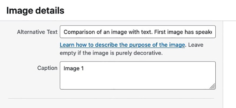
This text is displayed when the image is not able to load. It is also used by screen readers for people with impaired vision. So, use wording to describe the image as if you were telling someone what it is in a phone conversation. And don’t start with “photo of”. It is already understood that it is an image. Also don’t put the artist attribution in this field. The next section addresses attribution.
If you are using captions with your images, then use that area to further describe the image. You can use more details here. If I am describing the image in the article, then I use the caption area to label the image for reference.
Artist attribution
First of all, I’ll assume you already know that just because you downloaded a photo from Google images, doesn’t mean you are allowed to use it on your website. Images shown in Google searches are just that–search results. Those images you see, they belong to people. To use images on your site, you must know from where they originate and properly attribute the artist for their work. Different image providers and artists have different attribution guidelines. Refer to their documentation to know how to provide proper attribution. If there are no guidelines, or if you are using your own images, include the title of the image, name of the artist, and a link to their website or public image library.
Making Progress
As you can see, planning and preparing your website is a process. And the photos you use are no exception. The more time you put into preparation, the easier it will be when you begin putting it online. If you get overwhelmed and decide you need some help, I offer a 30 minute free Discovery Call to help you understand what you need and how to proceed. I’d love to end up working with you, but what you do with your information after the call is up to you. It may just give you the motivation you need to finish!